Learn
PDF Design Quality Checklist: Preflight Before You Publish
A practical preflight for typography, hierarchy, page breaks, tables, images, links, accessibility, and exact PDF proof before a document reaches a client or audience.
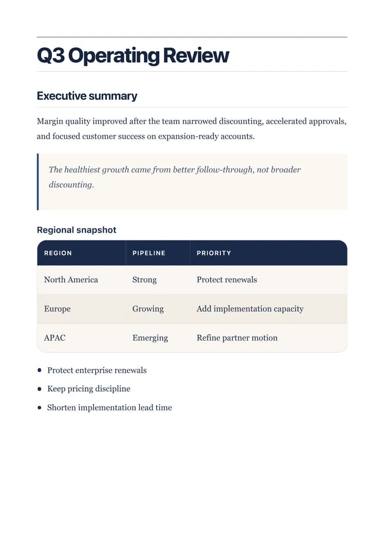
What you will produce
Try the related templateOn this page
A polished document can fail for reasons that are invisible while writing: a heading left alone at the bottom of a page, a URL that pushes a table beyond the margin, a low-resolution logo, or a font that looks elegant in the editor but becomes tiring across eight pages.
Use this checklist after the content is stable and before the PDF reaches a client, candidate, customer, or public audience.
1. Confirm the document has one clear job
Write down the action the reader should take after reading. Approve a proposal. Sign an agreement. Understand a report. Verify a certificate. Attend an event.
Then remove sections that do not support that job. A polished layout cannot rescue a document with competing purposes.
Pass when: the title, opening paragraph, section order, and final action all point to the same outcome.
2. Make the hierarchy obvious without decoration
Scan only the title and headings. They should tell a useful summary of the document.
- Use one level-one heading for the document title.
- Use level-two headings for the main argument or workflow.
- Use level-three headings only for genuine subdivisions.
- Keep heading levels sequential; do not jump from level one to level three for visual size.
- Prefer specific headings such as “Payment schedule” over generic labels such as “Details.”
Pass when: a reader can understand the structure in under ten seconds.
3. Check typography at reading size
Judge typography at 100% zoom, not while zoomed out to see the whole page.
| Element | What to inspect |
|---|---|
| Body text | Comfortable size, sufficient line height, and reasonable line length |
| Headings | Clear contrast from body text without overwhelming the page |
| Emphasis | Bold and italic used sparingly enough to retain meaning |
| Labels and captions | Readable at normal zoom, not treated as decorative microcopy |
| Font pairing | One family, or two families with distinct and consistent roles |
Uploaded fonts should include the weights the design actually uses. If only Regular is uploaded, do not rely on synthetic Extra Bold to create the entire hierarchy.
Pass when: the document remains comfortable through several consecutive pages.
4. Test contrast and color roles
Choose a small set of color roles rather than coloring individual elements independently:
- Page background
- Primary text
- Muted text
- Heading text
- One accent color
- Optional alert or status color
Body text needs the strongest sustained readability. Brand color is usually more effective on headings, rules, table headers, links, or small accents than across long paragraphs.
For a background image, add a scrim or quiet content surface wherever text crosses detailed artwork. Test both the lightest and darkest part of the image.
Pass when: every paragraph remains readable without depending on a specific screen brightness.
5. Stress-test the content that usually breaks layouts
Replace perfect demo content with realistic difficult content:
- A heading that wraps to two or three lines
- A table with six columns
- A long URL or identifier with no natural spaces
- A code block with a long command
- A Mermaid diagram with many nodes
- A portrait and a landscape image
- A list item containing several sentences
- A document long enough to create multiple pages
Shorten labels before shrinking text. Split a wide table before reducing every cell to an unreadable size. A design system should protect reading quality, not merely force all content onto one page.
Pass when: difficult content stays inside the page and remains legible.
6. Review page breaks as part of the design
Pagination changes the argument. A section heading separated from its first paragraph feels broken; a signature block split across pages feels careless.
Inspect every page transition for:
- Headings stranded near the bottom edge
- A single list item continuing alone on the next page
- Table headers separated from their rows
- Signatures or verification details split across pages
- A nearly empty final page caused by one trailing element
- Repeated headers, footers, and page numbers colliding with content
When a break is awkward, first tighten the nearby content or move a complete section. Avoid progressively shrinking the entire document to solve one local problem.
Pass when: each page starts and ends at an intentional point.
7. Inspect images, logos, and QR codes
Use the real exported PDF to evaluate visual assets.
- Logos should be transparent when they sit over a colored or image background.
- Photographs should have enough resolution for their printed size.
- Decorative images must not compete with the text hierarchy.
- QR codes need quiet space around all four sides and should be tested from the exported PDF at the intended physical size.
- Verification URLs should also appear as selectable text when the document is important enough to outlive a QR reader.
Pass when: assets are sharp, correctly cropped, and functional outside the editor.
8. Verify links, privacy, and document identity
Click every important link in the PDF. Check that visible link text describes the destination and that no private staging URL appears in the final document.
Also verify:
- The filename is descriptive and versioned appropriately.
- The document title matches the visible title.
- Confidential labels are correct for the recipient.
- No placeholder names, sample dates, or test QR destinations remain.
- External images are safe to load and will remain available when the PDF is generated.
Pass when: the file can be forwarded without an explanatory apology.
9. Approve the downloaded PDF, not only the editor
The live preview is for fast iteration. The downloaded PDF is the production artifact.
Open it in at least one desktop PDF viewer. For high-stakes work, also test one mobile viewer or print a representative page. Confirm:
- Fonts render consistently.
- Page geometry matches the intended paper size.
- Links and QR codes work.
- Text remains selectable.
- No element is clipped or unexpectedly rasterized.
- The final file opens without repair warnings.
Pass when: the exported file survives the environment in which the audience will actually use it.
A compact final preflight
Before publishing, answer yes to each line:
- The document has one clear purpose.
- The heading outline makes sense on its own.
- Body text is comfortable at 100% zoom.
- Color and contrast remain readable across every page.
- Tables, code, diagrams, and URLs do not overflow.
- Page breaks preserve complete ideas and functional blocks.
- Images, logos, and QR codes work at the final size.
- Links, filenames, dates, names, and confidentiality labels are correct.
- The downloaded PDF has been opened and reviewed.
When the checklist passes, save the choices that should repeat as a custom template. A reliable document system is more valuable than perfecting the same margins and font roles again for every export.